In the Know
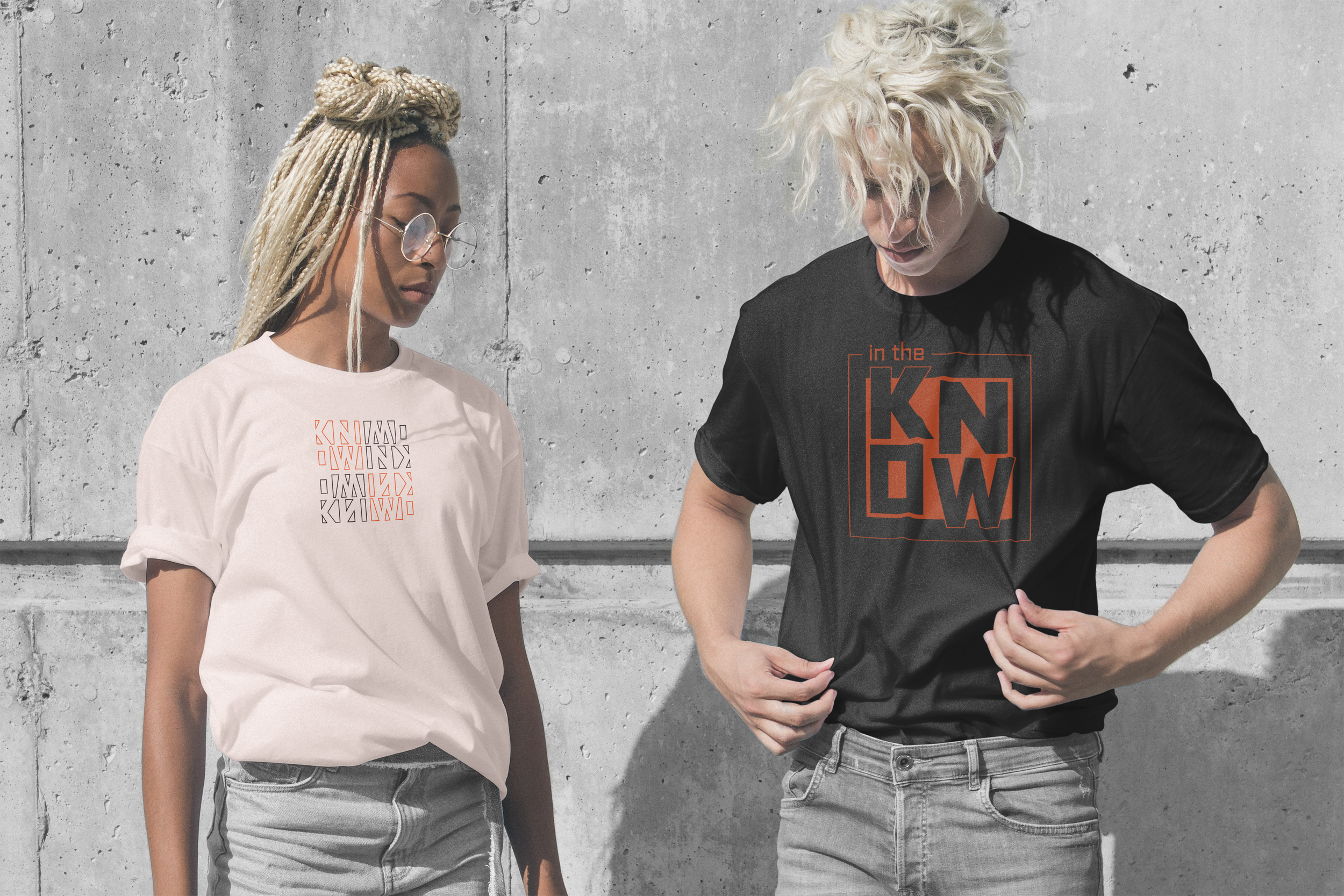
In the Know is a conceptual podcast brand made to compete and stand out against other brands in the podcast space. The phrase “in the know” refers to being up-to-date with facts or stories, a perfectly suited name for an informational news show. The overall goal for this brand was to create an identity that was bold and eye-catching and adaptable to various mediums.
Project includes:
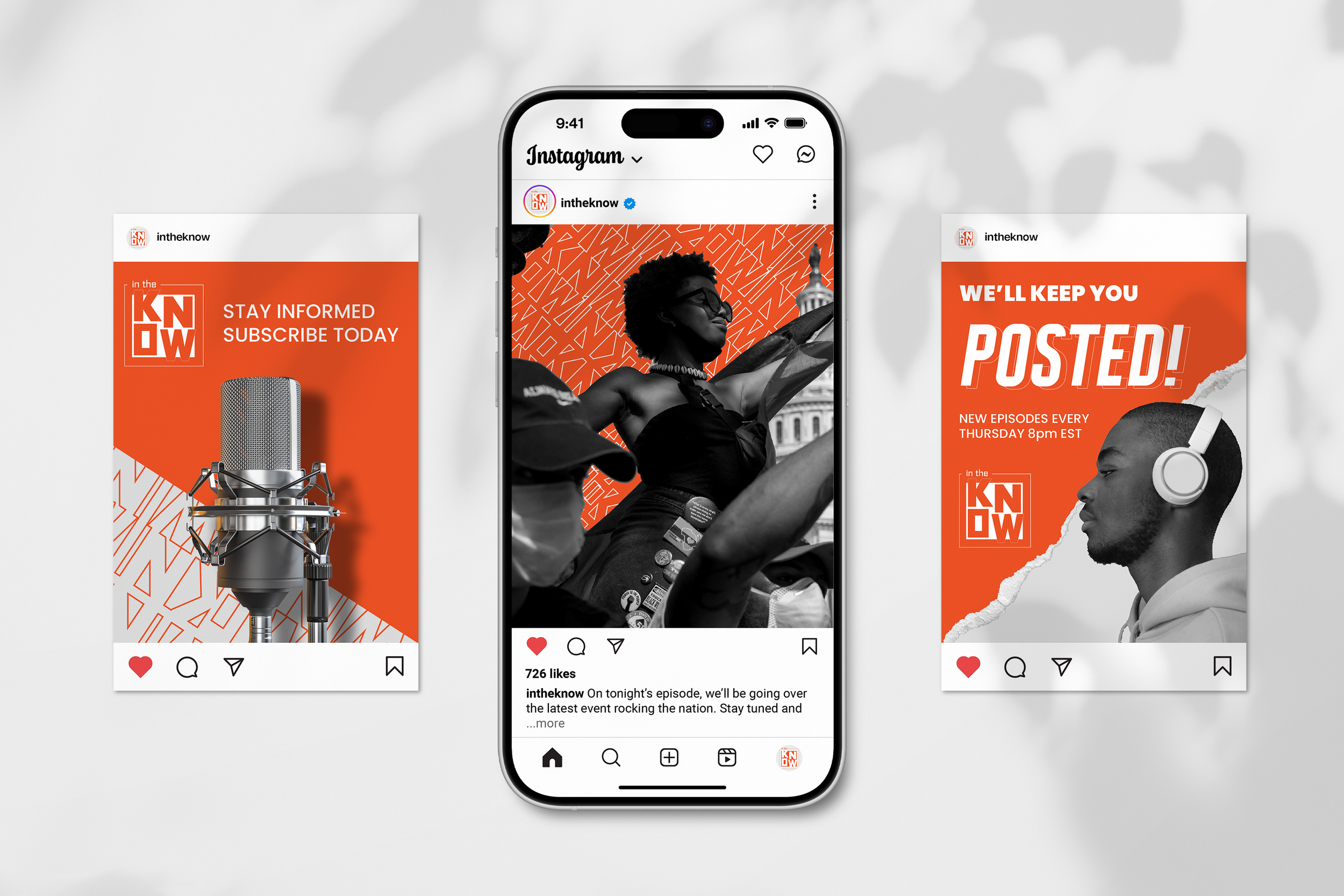
LOGO VARIATIONS / PATTERNS/ VISUAL IDENTITY/ PODCAST INTERFACE/ INSTAGRAM POSTS / DISPLAYS/ MERCHANDISE/ ANIMATIONS

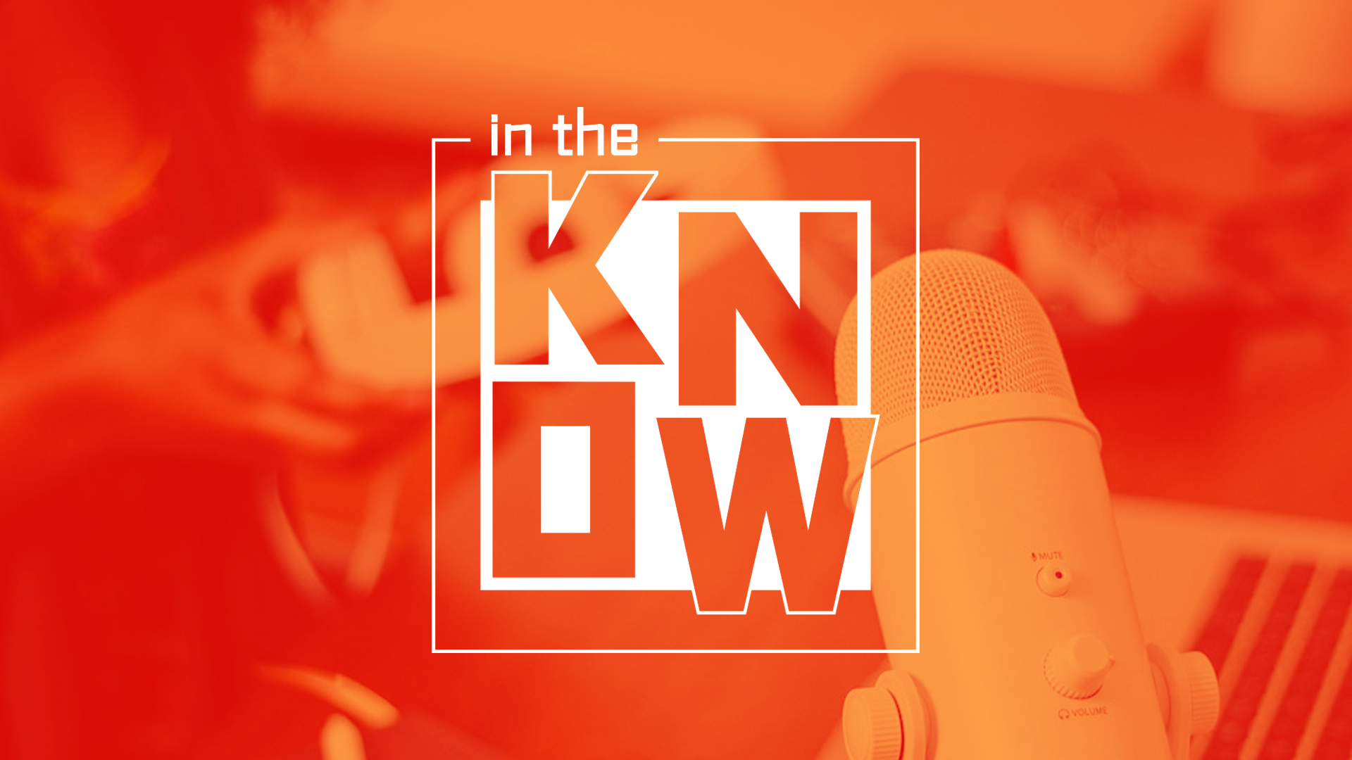
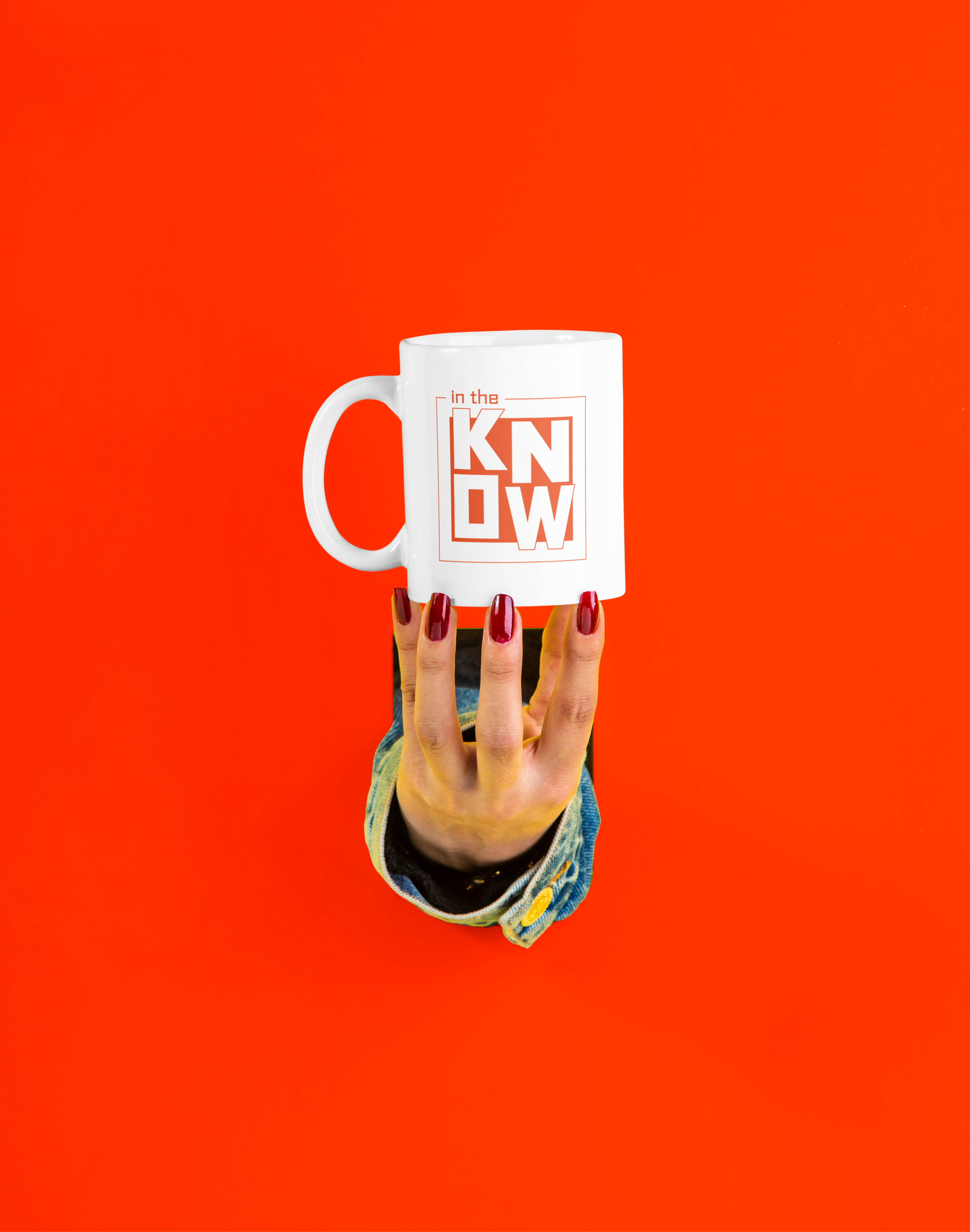
Keeping in theme with being eye catching for the logo, emphasis was put on the word “know” through use of bold typography and high contrasting colors. The “Know” part of the logo mark was created using the typeface Arial with some modification of the “O” which has been squared. The “in the” part of the design employs the typeface Politica, whose family goes on to be used in the rest of the following designs for display headlines. Below you’ll also see three logo variations.

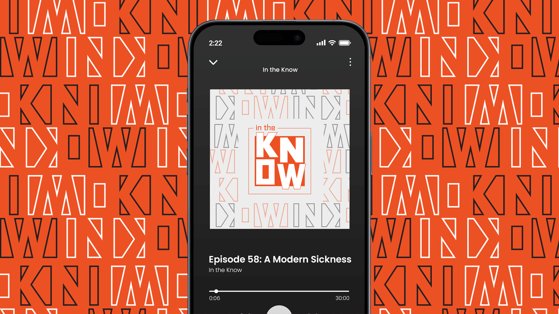
The In the Know “know” pattern is a flexible and integral part of the brand’s identity. The pattern’s creation started with me employing “gestalt theory” and trying to see if I could recreate the logo only using the space between and around the letters. The end result is a unique pattern becoming an integral part of the design and overall brand’s identity.


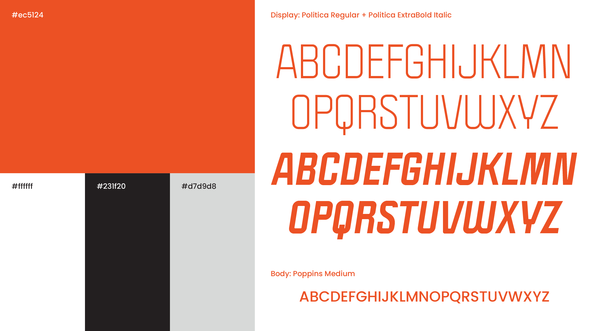
Politica, the sans-serif display font used in the logo and for display headlines, offers a variety of unique usages for this brand. It’s bold and unique look pairs well with the body copy and logo typeface, allowing me to create hierarchy throughout several of the designed pieces below.


Logo & Pattern Animations.
Here are some animation tests for the In the Know logo and the “know” pattern. It’s always fun to see how you can add movements to words.
